What our favorite fast food joints looked like back in the day Part I
 Fast food franchises have been around for years. Some of the first ones were started back in the ’50s as malt shops or diners. Since then, there have been many different variations of the fast food franchise; burgers, chicken, ice cream, seafood, family-style, etc. As the type and menu changed, so have the styles, image and logo of the establishment. Many of the most popular fast food franchises of today have been around since the ’60s and if you were to travel back in time to see your favorite restaurant as it stood back in the day, you may not even recognize it.
I was perusing some of the photostreams in Flickr as well as some of my favorite fast food groups and you can see plenty of awesome pictures of fast food franchises and how they used to look back in the day. I even remember some of them! So let’s take a look at a few of the more popular franchises and how their “look and feel” has changed from ’60s until now.
You can click any of the below pictures to see them BIGGER.
McDonald’s
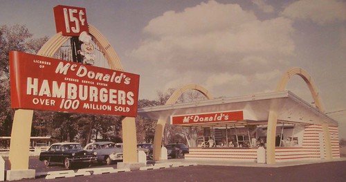
McDonald’s began in 1940 with a restaurant in San Bernandino, CA opened by (surprise, surprise) the McDonald brothers. They developed their “SpeeDee” delivery system in this restaurant that has become the basis for all modern fast food franchises. Ray Kroc, a salesman providing milkshake machines to the brothers, convinced them to let him franchise their operation in 1955. Kroc bought out the brothers and took McDonald’s to the lofty heights you see today. Due to its long history, McD’s architecture has had more face lifts than Joan Rivers. There are so many different styles of McDonald’s restaurants that it’s almost impossible to nail down different eras of buildings. Don’t even get me started on the different styles for the “golden arches” signs as there are too many to even begin a listing here. I could probably do an entire article on McDonald’s architecture and store design (*note to self). Moving along, the picture above is one of the earliest building incarnations from a McDonald’s in the ’50s – ’60s. Many McDonald’s restaurants today are being built in this “retro” styling. Check out the huge, modern, 2-floor McDonald’s in Chicago that was built in this style.

This is probably one of the more familiar versions of the McDonald’s restaurant. It’s brown roof with white striping has become iconic for McDonald’s lovers as it’s visage was used throughout the ’80s in commercials. This style started, I believe, in the ’70s or ’80s. There was also a version of this building with yellow striping on the roof.

Every few years a new McDonald’s building type will get introduced. Here’s a newer, stacked-stone style architecture as seen in the McDonald’s restaurants around my neighborhood here in Jacksonville.


McDonald’s is big on “theme” buildings. They will design unique restaurants to draw attention and publicity in order to get more people to visit the stores and buy food. The first pic on the left is a Mickey D’s diner. This was a short-lived trial by McDonald’s in a select few cities. Second from left is a jungle themed McDonald’s in Niceville, FL. The next pic is a McDonald’s Bistro found in Orlando, FL. It contains upscale menu items including panini sandwiches and gelatto. As you can see, McDonald’s is all about trying new and different things. That’s probably why I’m fascinated with them.
Taco Bell

Glen Bell opened the first Taco Bell in Downey, CA in 1962. The picture above shows what those first Taco Bell restaurants looked like. The building looks more like a place to buy illegal fireworks than a beefy burrito. I love the ancient sombrero/blanket/bell sign. I think a few Taco Bells today still use that sign. To make it even more awesome, most of these restaurants in the ’60s had a statue of a little Mexican dude out front. Ole!!

In the ’80s, the bell logo was updated. They also updated the color scheme to what can only be described as “doo doo” brown. **Insert Mexican food joke here** This particular styling can still be readily found in the brown or purple color schemes.

In the ’90s the color scheme was updated, as I said earlier, to purple. In the last few years the architecture style has also been updated to what is known as a “bistro” style. Very modern. Lame, but modern.
Arby’s

Arby’s was started in the late ’60s in Ohio. Here’s what some of the first franchises looked like. I love that “big hat” sign. How many of you remember the Arby’s “big hat”? Those “big hats” were used for years until Arby’s updated the 10 gallon hat for a more modern hat in the ’70s. The Arby’s in Hoover, AL where I grew up had a “big hat” for the longest time but changed it sometime when I was in college, I think. Many Arby’s restaurants today still have the vintage “big hat” sign despite it’s official “discontinuation” and it has gained quite a few fans wherever it exists. As a matter of fact, there’s a Flickr group dedicated soley to its enormous awesome-ness. Get a better look at the vintage “big hat” sign here. Also check out the vintage big hat in glorious color and motion here.

Here’s the newer, updated Arby’s from the last few years. I think they started updating in the late ’90s. You can also see the newer, modified version of the “big hat”. Not as much character as the old one, I think. Like I said, you can still find many of the newer restaurants with the old “big hat” sign out front.
Kentucky Fried Chicken


KFC is one of the elder statesmen of fast food restaurants. The Colonel started making his chicken in the ’30s and served it out of an old cafe/gas station he owned in North Corbin, KY. He didn’t actually open the first KFC until the early ’50s in Utah (yes, the first KFC was in Utah). I’m not sure what some of the first few restaurants looked like. In the picture above, you can see images from a product catalog showing building and sign designs for a Kentucky Fried Chicken franchise in the ’70s, which probably was developed in the ’60s. Gotta love the giant, rotating bucket that will show up on signs all the way into the ’90s! The building looks like a circus tent.

Here’s a picture of a slight redesign of the ’70s architecture and sign. You can still see the red/white steeple on top (though modified) but the huge sign is gone and the rotating bucket of chicken is the only sign the Colonel felt they needed.


In ’91 Kentucky Fried Chicken re-branded itself to the abbreviated KFC. Here you can see the modified logos for this re-branding on the signs and giant, rotating buckets. There are many rumors going around about why this happened. Some say the state of Kentucky had trademarked their name and wanted royalties, some say the restaurant wanted to de-emphasize the word “fried”. Whatever the reason, it caught on and now the restaurant is mostly known as KFC. Interestingly enough, in 2007 the full Kentucky Fried Chicken moniker began returning in advertisements, packaging and new restaurants.

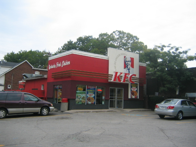
Similar to Taco Bell (as they are both owned by Pepsi), KFC is modifying many of its restaurants to the newer “bistro” style architecture. Also many of the rotating bucket signs are being taken down and trashed. I found a bucket in Montgomery that had been taken down and was laying on the ground ready to be trashed in the near future. It’s sad, I really like the giant spinning bucket.

This was not an “official” KFC architecture, but it has become one of the most famous. The KFC “Big Chicken” restaurant in Marietta, GA was originally built in the mid 1950s as a Johnny Reb’s Chick, Chuck and Shake (yes, you would be correct in thinking that this name kicked ass). It was later sold and made into a KFC franchise. In the early ’90s it was almost torn down but public outcry saved the day and the chicken was refurbished and renovated.
So that’s the first batch of fast food restaurants that have had major changes throughout the years. When I started this article I didn’t realize how much info I was gathering. I’m going to have to split this into two parts. In Part II of this article I’ll look at other famous eateries like Burger King, Dairy Queen and Pizza Hut. So come back next week for Part II.
Until then, you can find me at KFC getting a bucket of extra crispy.
UPDATED — Part II of this article can be found here


February 4, 2009 at 11:39 am
[…] Cavalcade of Awesome All Pax. All Nude. All the Time. « What our favorite fast food joints looked like back in the day Part I […]
February 5, 2009 at 4:29 pm
I went to this neat McDonald’s when I was in Chicago as a kid but I can hardly remember it now. Sure wish I hadn’t been out of film! There’s a space one in Georgia that has a rocket-ship as a playground and there’s one in Alabama that has motorcycles inside too. I grew up near the Big Chicken 🙂
February 5, 2009 at 7:49 pm
There is still a Big Hat Arbys sign in Flint Michigan on Miller Rd. I started working at Burger King in 1968 for $1.00 per hour. Today, I own two of my own and I still make about $1.00 per hour.RD. Thanks for the look back. Mike (A Whopper cost .49 cents)
February 9, 2009 at 6:48 pm
thanks paxton, now I am hungry 🙂
it is interesting though, seeing how these fast food establishments have changed throughout the years. great post!
February 15, 2009 at 11:10 pm
Hey Pax,
I worked at Tacp Bell in 1970 and it looked just like the one in your picture, with the sombrero, serapi, bell sign also.
April 2, 2009 at 1:35 pm
do you have any idea if there is a picture of Mars fast foods… i think from the early mid 60’s… manitowoc wisconson had one…..long long ago.. i think the most sites they had before going under (taco bell took over most of the sites…i believe) was 15-16? thank you for any help you can provide.. if it helps i have a vag memory of plaid uniforms….. thank you again, Ro
July 24, 2016 at 7:36 pm
I remember a Mars fast food restaurant in Portage Wisconsin. It went out of business in the 70s. I cannot find a picture to show my kids and would love to see one.
February 3, 2010 at 1:47 am
Hey this is a great page!
May 30, 2010 at 10:07 pm
Another great piece. I personally miss the 80’s-styled McDonald’s, but at least some of these themes are interesting. Sadly, around here, it seems like the newer stuff is just more… dull. Generic, almost. Pictures on the wall of nothing in particular, and little sign of Ronald. Even less of his friends.
The old Taco Bell looks pretty wild.
I’ve seen a big-hat Arby’s somewhere. Sadly, the only restaurant we had nearby closed a few years ago, leaving the only Arby’s I’m immediately aware of in the nearby vicinity in shopping mall food courts. And those just lack the ambiance I enjoyed.
KFC… my dad told me the one that was nearest to us back in NC had closed down, which was sad for me. At least there’s another, older one further up the road for when I visit…
May 23, 2011 at 9:59 am
Great article/pictures. I’m a big fan of fast food, though I don’t eat at these places as much as I used to (or as much as I would like). Reading this article brings back an interesting fast-food related memory: I grew up on the East Coast, and I remember back in the early ’80’s I enjoyed going to Jack in the Box & having their signature tacos. For some reason, shortly after that the chain closed their stores where I lived and at the time, I thought they had gone out of business. Then, years later (mid 1990’s) I was in the Mid-west and saw a Jack in the Box – I had some of their signature tacos, and they tasted exactly the same as they had 15+ years earlier. Great memories.
December 25, 2011 at 10:11 am
lawak…
[…]What our favorite fast food joints looked like back in the day Part I « Cavalcade of Awesome[…]…
January 5, 2012 at 8:41 am
marocain…
[…]What our favorite fast food joints looked like back in the day Part I « Cavalcade of Awesome[…]…
February 11, 2012 at 2:06 pm
Learn More About Free Electricity…
[…]What our favorite fast food joints looked like back in the day Part I « Cavalcade of Awesome[…]…
July 29, 2014 at 4:15 am
Thanks for the marvelous posting! I definitely enjoyed reading it, you can be
a great author.I will always bookmark your blog and
will often come back someday. I want to encourage yourself
to continue your great writing, have a nice holiday weekend!
October 4, 2014 at 8:10 pm
That is a great tip particularly to those fresh to
the blogosphere. Short but very precise information… Appreciate your sharing this one.
A must read article!
October 4, 2014 at 11:52 pm
When I originally commented I seem to have clicked on the -Notify me when new comments are added- checkbox and from now on each time a comment is
added I get four emails with the exact same comment.
Is there a means you can remove me from that service? Kudos!
October 6, 2014 at 4:11 pm
Hurrah, that’s what I was looking for, what a stuff! present here at this weblog, thanks admin of this site.
December 20, 2014 at 1:03 pm
Using CSS to style your pages will be simpler because you can style all elements on your site at once.
Today, especially during our challenging economic times,
invoice factoring services can be a beneficial
tool for business owners worldwide. ” To treat both of these groups the way you would want to be treated would be to lessen your effectiveness by at least 50%.
January 25, 2015 at 1:16 am
Sorry everybody this is the only method you could do it.
Merely sit down and also play the guitar part again and again once more.
February 6, 2015 at 5:58 am
This post provides clear idea in support of the new users of blogging, that genuinely how to do blogging.
May 23, 2015 at 10:28 pm
There are a variety of methods to tone bicep muscular
tissues: 1. Barbells as well as pinheads, as well as 2.
bicep devices as well as cables.
June 11, 2015 at 2:42 am
Deep, surgery or damage scars – Use for no less than 6
months.. So that, ultimately, your scars fade QUICKER and EXTRA DRAMATICALLY!
June 20, 2015 at 3:41 pm
Private Cash Service has nothing at all to do with credit choices
or credit inquiries on the customers.
June 21, 2015 at 1:40 am
Slipped prongs and lost stones are two other quite common problems found with jewelries and can also be easily repaired without much of a problem.
However, like any good fashion, earrings have come in and
out of style numerous times. If necessary, go from door to door and bargain on the spot.
Nowadays, costume jewellery is considered as jewellery articles to wear with specific type of clothing to improve the appearance and personality levels.
Elizabeth Taylor was very fond of rubies and when her legendary jewellery collection was sold in 2011
there were some lovely ruby pieces in the catalogue.
It’s a bit painstaking, but it makes a admirable presentation. Statement jewellery is bold, and
usually attention-seeking, and this can be specifically the kind of
reaction that a person sporting a bit wants.
Spend some time doing a little bit of research and compare prices in different stores
as you will find big differences and also make sure that you
check the reviews so you can see the service that this store offered its previous customers.
Designer handmade jewellery are also dazzling with a
variety of precious stones like ruby, emerald, opal
and sapphire, diamonds, topaz which makes the items gleaming and flashy.
They can also get access to the most fashionable earrings available today since we’re all aware that there are no limits for
men to wear whatever type of jewels they want.
September 9, 2015 at 9:35 am
aerogarden
What our favorite fast food joints looked like back in the day Part I | Cavalcade of Awesome
September 14, 2015 at 11:02 am
A superior beginning point of any diet regime is to take a appear at what you consume in a day.
September 14, 2015 at 11:03 am
The Venus Factor Exercising system is fundamentally a exercise regime that you have to complete in order to be thriving with the plan.
September 15, 2015 at 6:48 am
full report
What our favorite fast food joints looked like back in the day Part I | Cavalcade of Awesome
August 23, 2018 at 6:01 am
[…] Source: […]